Visual Arts
I create art to bring out the unnoticed beauty of life.
I create art to bring out the unnoticed beauty of life.
The color palette I chose was purple because it reminded me of fifth grade which was a good year for me, pink because it was my childhood best friend's favorite color, teal/blue because it was my favorite color as a child, and red because in my culture it symbolizes luck. I used origami to create some of the butterflies because one of my memories from a child that I remember well was my friend's mom coming into our preschool class and teaching us how to fold origami. It is also a part of my Asian culture and paper isn't something I usually useas a medium in my art, so I wanted to try to incorporate it into this piece as origami was something I really enjoyed doing as a child. I've noticed that in a lot of my art pieces, I use purple, red, and/or blue very often without even realizing, as well as on my dreaming page I said I wanted to work with more cool toned colors, which would be blue and purple. I very fondly remember so many bits and pieces from my childhood and as I realize how fast I am growing up, sometimes I pine to go back to when I was younger. The pillow pet was something I had gotten when I was younger, maybe when I was 4 or 5, and I still have it now, at the age of 16. It matched with the color scheme, so I thought it was fitting. Since it is a butterfly, I decided to add other butterflies, but in different styles, to represent growing up and maturing. There's some paper in the background connecting the different butterflies, to help convey that even as you grow up and life goes on, you are still connected to your past, and your childhood stays with you.


When planning for this piece, I took a bunch of my own photos reaching out or kicking the camera, any type of motion towards the camera. I took these photos by myself, so I tried to actually move right as the picture was taken to try to capture more movement in the photo. When planning for the final piece, I used watercolor, colored pencil, and marker to do my sketches in, and I really liked using watercolor but I liked the way the colored pencil looked cleaner, so I decided to just do mixed media so that I could use both. The reference I chose for my final I liked because the figure looks like it is sinisterly reaching out towards the camera as if it is in power and wants something from the viewer. In my sketch, I tried to make the background the darkest, and the hand the lightest, so it was closest to the viewer is the lightest and it gets darker as it gets further away. I did this to add more to the thought that the figure is reaching out towards the viewer as well as to add emphasis to the hand. On the final piece, I added some lines for texture in the background, as well as to make it more dynamic to add to the idea of movement. The hand is also colored orange because it contrasts with the blue and I thought it would add more emphasis towards the hand, but I think I wish I had left it white or even did a lighter blue. With my other works from this year, I have incorporated a mostly cool colored or cool-toned palette, which was on my dream page, as well as drawing from my own reference photos. Foreshortening is a concept that is completely new to me, so at first, drawing all the body parts a little wonky was a little foreign to me and it felt a little "wrong," but when you really take a better look, it really does look like the subject is moving towards you.


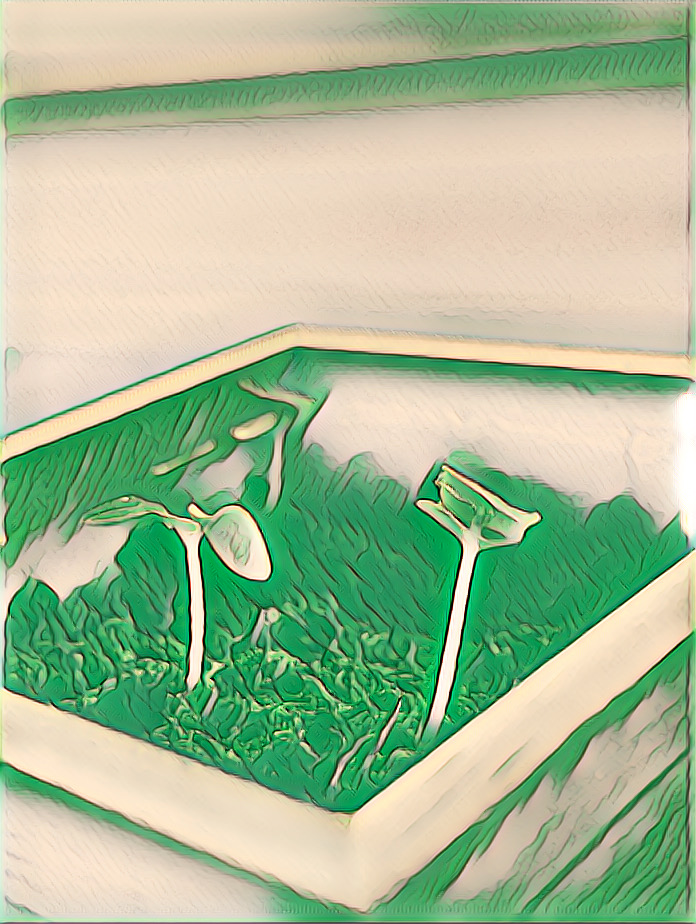
In the objective piece, I made the almost whole thing green, as green represents growth, and it also made the sprouts stand out more. In the non-objective piece, which is the black and white draft from before, I used an effect that created vertical sections in the photo, because it being vertical reminded me of growth. I also used a warping tool to try to stretch the sprouts to be more elongated, but I don't really think I achieved what I was going for, but it is a little bit difficult to tell what the image is supposed to be of. Together, they don't really look like a cohesive series, but I do like how one of them is practically all green and one of them has very little green, so they are contrasting.

With this project, I experimented and used digital editing to abstract my references. For someone who did not have a lot of experience with photo editing, I am not unhappy with how I did, but I do think that I could've done a little bit more to try to get to "growth." Whenever I did edit photos, however, I would really only edit the colors a little bit, so it was definitely a little exciting to mess around with the shaping of the pictures. The objective photo also shows texture in a fun way that I did not know you were able to emphasize with digital editing. It would've been cool, I think if I had combined the two edits together, where it's an all-green photo with the vertical sections.
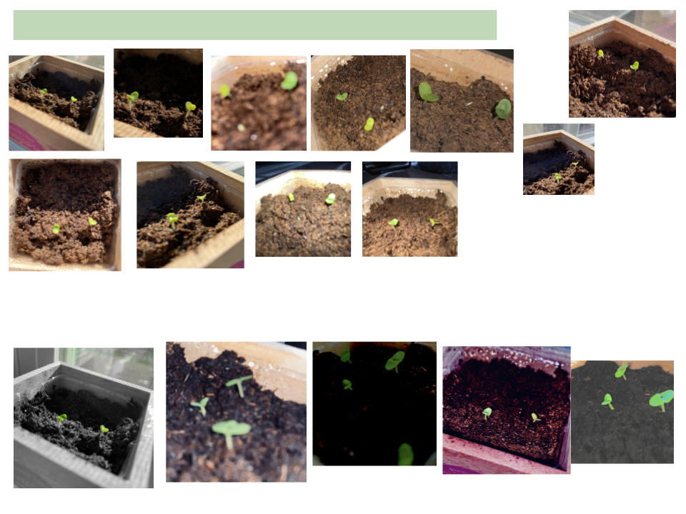
Recently, I planted this basil plant and when I saw the word "growth" on the list of concepts, I knew it would fit perfectly. Over the course of about two weeks, I took pictures of it daily as it grew. When deciding on whether I wanted to do digital or acrylic, I decided on digital because I don't normally do digital, so I thought it would be fun to try.
Just right in my phone's photo editor, I started playing around with some of the features. In one of the photos, I turned it pink, because red and green are complements, so the green would stand out more. I really tried to make the green plants stand out, so in a way, it kind of communicated that growth can still happen through anything. Such as in the black and white draft, in a world of dullness, they still had color and still grew. In my final two pieces, I used the app Picsart and played around with some of the effects they had on there to abstract my pictures more.


Overall, I am very happy with the way my two canvases turned out. If I had to pick a favorite, I would say that canvas 2 was my favorite because I liked the small contrast between the background and the subjects because the tubes are more detailed than the background, making them stand out a bit more. I am still happy at the outcome of canvas 1, but this was my first time using the glazing medium, so it did turn out a little bit messier, but I think I definitely did a good job color matching. While I use acrylic paints a little often, I was able to get higher quality acrylics and they were a lot of fun to work with and you can definitely see a difference in the quality of acrylic paints in tubes versus the cheap craft acrylic paints in bottles.

For my second canvas, I revised canvas 1 instead of starting a whole new canvas. I struggled a little bit with texture because there is not a whole lot of texture in the reference image, but the caps of the tube had the most texture, so I tried to amplify those on canvas two. I tried to make the background look as smooth as possible, so I actually just painted it one solid color to make it look smooth. I also went in and added more details to the caps, including more shading to try to add the illusion that there are ridges in the caps. If I could redo this, I would definitely try to change more of the tubes to exemplify texture more, because I didn't really change them that much.

For the black and white rendition of canvas 1, I think I really good job of matching the values, which was good for glazing since I didn't have to create different values of the color. It went right over the black and white, and still matched the values that were already down, and still matched the colors from the reference image. I think I could've done a better job putting down the paint though, you can see some of the paint strokes, but I did try to apply it in a way that matched the contour of the plate the tubes were on, and for the tubes, I tried to apply the paint horizontally that matched the tubes.


After I created my gesture sketch and my contour sketch, I made two renderings- one in graphite pencil to get the shading and one in black colored pencil to match the values. I also did two value scales, one using stippling just for practice and one in acrylic because that was the medium I used. I used the colored pencil rendering to test the glaze before I put it on my canvas as well to make sure that they were the colors I wanted. For most of the colors, I was able to just use the primaries: red, blue, yellow, and white and black. For the green cap, I couldn't get the intense, vibrant green, so I had to take another green acrylic paint I had that was similar and use that instead. I did have to add in some blue, however, to get it closer to the reference image. If I was able to do this again, I think I would spend a little bit more time trying to match the green with just the primaries.
I used red behind negative space to try to bring emphasis to it as it contrasts with the cool colors being used everywhere else on the page. I used black on the dreams of negative space, emphasis, and ink to also bring more attention to those, as after negative space, emphasis and ink were the next two biggest ideas. I think I could've done a better job with emphasis, such as using a brighter color in the rectangles to emphasize the color. Texture and cool color palette are not as eye-catching as they are not my biggest dreams on the page. The flowers are lilacs, although they are a little unrecognizable, and were added for the cool color palette dream. With the leaf for texture, I could've used sharper, cleaner lines, because although you can tell that it is a leaf, it does not have the best leaf texture. I also started a theme with all of my doodles, as all of them, minus the negative space because I started with it, is nature related.

My brand is a small bunch of lavender flowers with a wax seal stamp holding them together. My favorite color is purple and I know when a lot of people think of me, they often associate me with purple, so I had to include it. I also really like flowers, and my favorite shade of purple is lavender, so it was fitting. The wax seal has an N with a line through it, but it's not meant to be an N, it's actually a combination of my initials, TNT. With a little imagination, you can see it. At first, I tried a rectangular banner design where the seal is, but I ended up not liking it and decided it would look better circular. Over quarantine, I've starting mailing more letters out to friends I have in different states, and I used wax seals to decorate them, so when I imagined the circle with my initial signature in the middle, I thought of a wax seal. In my planning, you can see there is a disco ball because my favorite song at the moment is Taylor Swift's "Mirrorball," but I couldn't think of any way to incorporate a personal touch into it. There is also a small carnation doodle because my favorite flowers are carnations, but I also couldn't come up with a design I liked using the carnations. The final logo is digitalized because I've been wanting to try out digital art, so since my brand is so simple, I thought it would be good practice. The original on-paper design also didn't look as clean as I hoped when I scanned it, which is another reason why the final brand is digital.

Using Pop Art (intelligent use of bright colors, designs focusing on line, shape, color and pattern) design an illustration of each PRINCIPLE and assemble them into a small picture book.
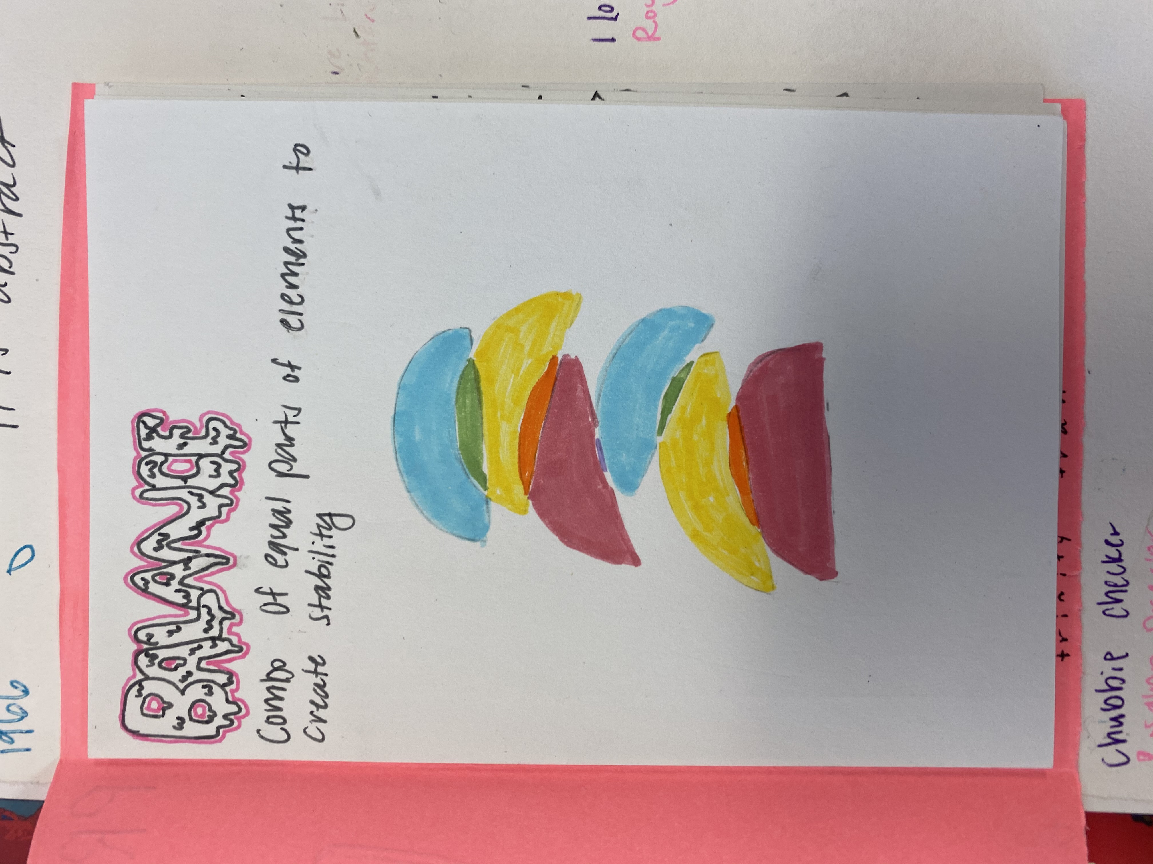


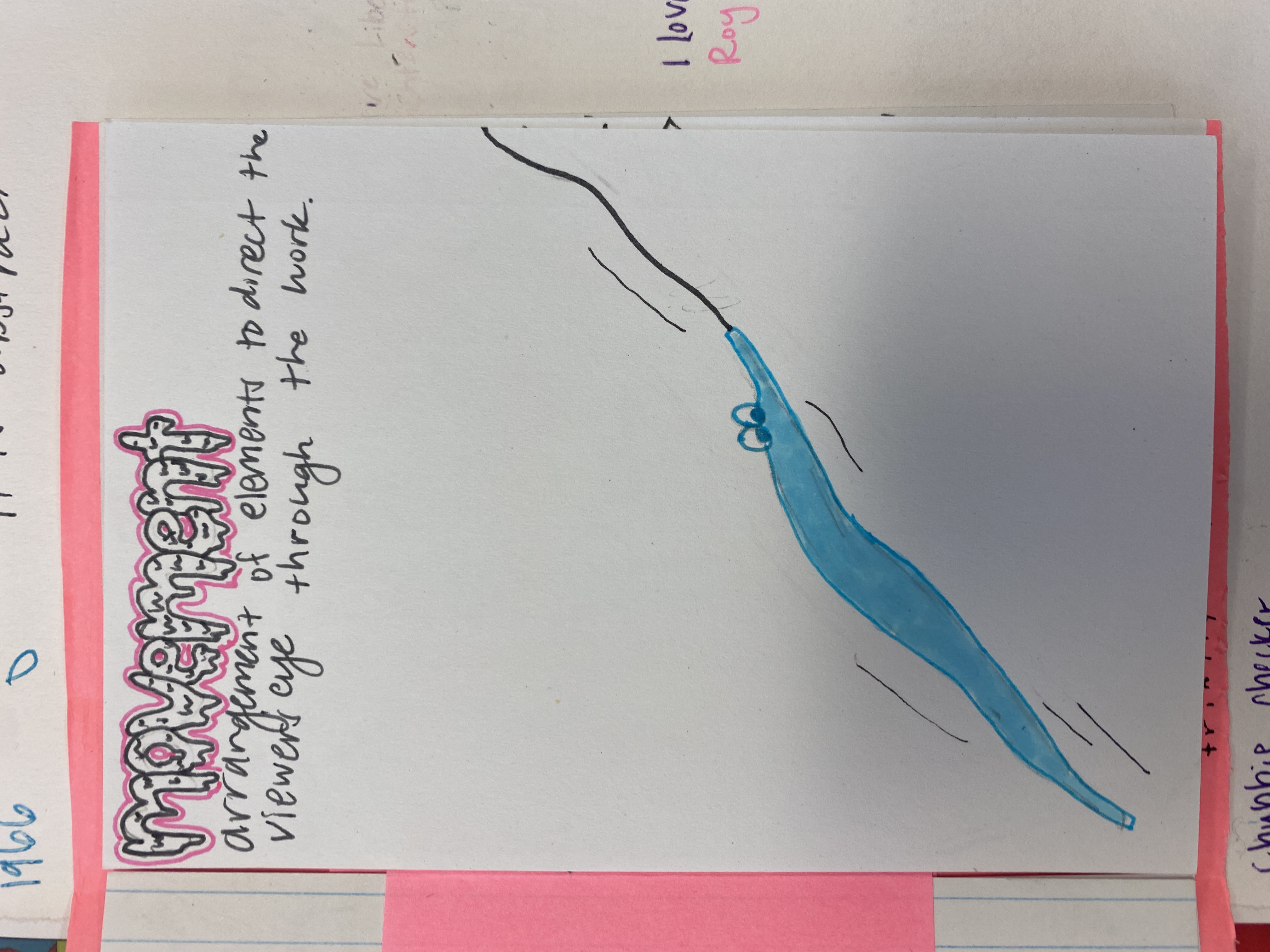


Using the SAME subject (possibly different reference images), create a series of 4 abstractions

For my piece with abstraction using zoom, I took my picture, zoomed into multiple places in the picture, and took a screenshot of it. Once I had about 6, I looked through all the pictures and looked for the one that was most non-objective. I even asked some of my friends who don't know anything about the project to see if they could recognize what was in the picture that I chose and 3 out of 10 could recognize what it was.


I turned all the lines in my picture into straight edges and shapes and used the values of the red, blue, and yellow to match the values in the picture with markers.
I was inspired by Roy Lichtenstein, with the colors and the shapes.
This one was also the easiest for me because the concept was easiest for me to come up with and visualize because of the inspiration from Lichtenstein while the other ones took me longer.


I used one continuous line for each color without lifting up my pen.
I think I had to pick one piece to redo, I would redo this piece because It is very easy to recognize, as if nothing changed at all and it is not very easy to tell that it was abstracted


I replaced the actual colors in the reference photo with the primary colors that matched the similar values.
The medium I used for this was watercolour, which is something I would like to explore more because my skills with it are very beginner, but it does seem like a fun and interesting medium to use.


I chose to keep the pure colors in the middle of the web because I like how they popped in the middle and how it can make your eyes look from in outwards or out inwards. I also chose the placement of each tone to be shade to tint to neutral to shade to tint to pure because I wanted each layer to contrast with the layers above and below it. Now, looking back at it, I would rather the placement to have been shade to tint to neutral to tint to shade to pure because I feel as though the neutral and the tint would've contrasted with each other better. I also had debated outlining it in black, to make it more clean and it would bring out more of the spider web design, but I like how it looks without the outline, it helps you see each layer together, instead of each layer individually.

When I started this piece, the double complements I chose were blue + orange and yellow + purple. I had done the neutral wheel first, so I wanted to do a design to match with the spider web, but I couldn't figure out how to incorporate a spider or a web into the square. When I saw the blue and the orange, it made me think of the monarch butterfly and the blue morpho butterfly, which is what inspired the butterfly design. I chose to do roses as the background because I wanted the background to be a color that wasn't in the square, and I also liked how magenta + green was also a compliment. If there was anything I could change about this piece, I would probably try to make the butterfly less square, and look a little bit more like a butterfly.


2/11 - Some progress of selfie 2 x 2
2/14 - 14 squares complete
2/18 - 22 squares complete (focused on facial features)
Left unfinished due to COVID-19.

For my final skin tone pear, I chose to do it with Prismacolor because I found it easier for me to work with and I struggled with using acrylic. I tried to make the texture of the pear more spotted but also smooth, the leaf was more rough and the stem is completely smooth. I also decided to do a skin tone in between the two pears I had already done in Prismacolor because it was a bit more closer to the skin tone of my subject for the memory project.

The acrylic paint pear was harder to do for me. I chose to do a darker skin tone because I had chosen to do lighter skin tones with the Prismacolor. I found it harder to blend and to get higher and lower values. It was also harder to get texture and to get it to a clean pear shape.
(yes I did spell acrylic wrong)

I decided to do two pears with Prismacolor, one with a lighter skin tone and one with a slightly darker skin tone. It was a lot easier for me to blend with Prismacolor than it was for acrylic paint and it was also easier to get high and low values.
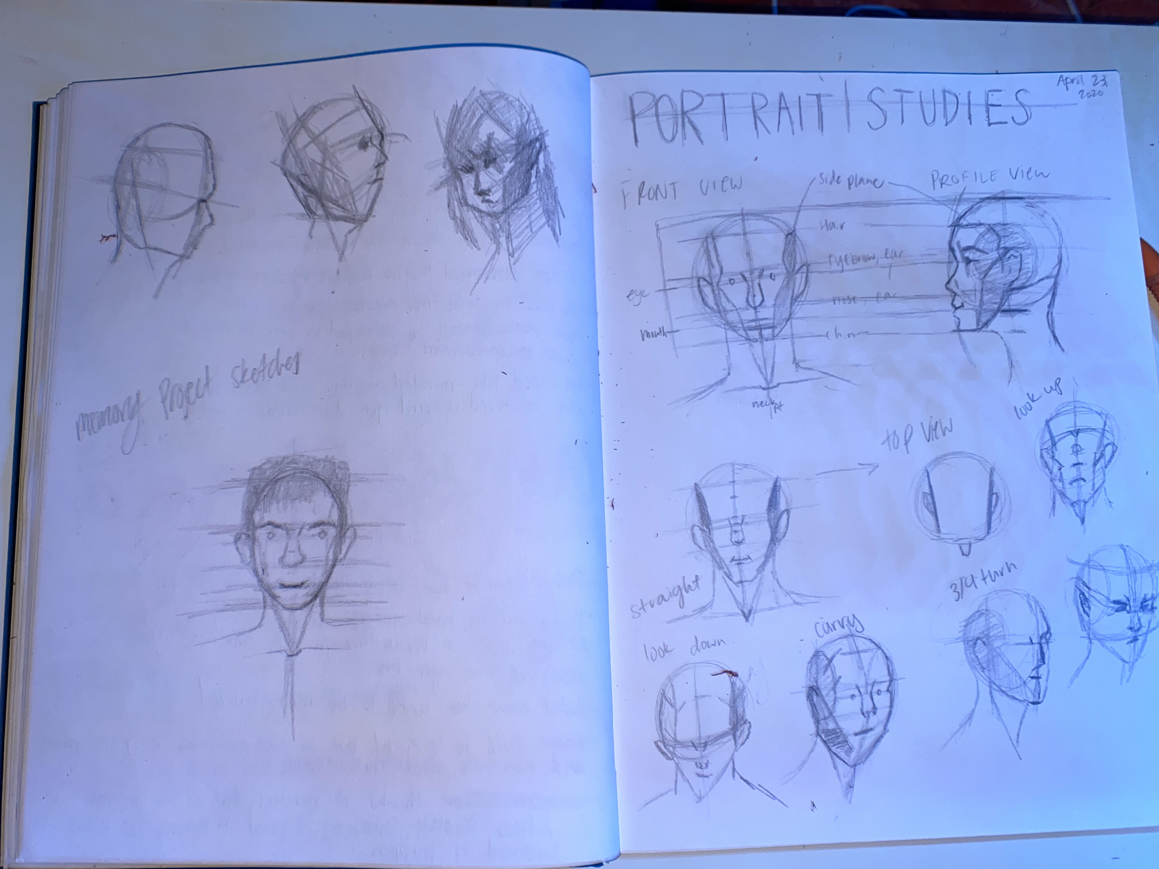


Left unfinished due to COVID-19.


